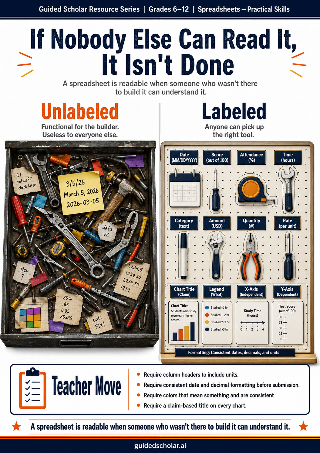
A teacher opens a student’s spreadsheet and cannot tell which column is which. The headers say “Data 1,” “Data 2,” “Category.” The dates are formatted inconsistently — some as “3/15,” some as “March 15,” some as “15-Mar.” The numbers in the totals column mix decimal places. The chart has no title. All the data is there. The spreadsheet is not usable.
Most students have been taught to enter data and build formulas. Most have not been taught to make a spreadsheet legible to someone who was not present when it was built. The difference between a spreadsheet that communicates and one that merely stores data is a set of formatting decisions that take less than thirty minutes to apply and make an enormous difference to any reader.
Headers That Actually Describe the Data
The column header is the reader’s entry point into the data. “Column A” and “Data 1” are not headers. They are labels that tell the reader nothing. Headers that work are specific, brief, and include units where relevant.
Unhelpful: Date | Category | Amount | Total
Helpful: Date Tested | Student Name | Score (out of 100) | Letter Grade
The unit in the header eliminates a question every reader would otherwise ask. “Weight” is ambiguous. “Weight (kg)” is not. “Total” could mean anything. “Total Sales ($)” cannot be misread. The investment is three or four words per column. The return is a spreadsheet any reader can interpret without asking for clarification.
Formatting Consistency
The single most common readability problem after unclear headers is formatting inconsistency. Dates entered in three different formats in the same column force the reader to recognize three equivalent formats as equivalent — cognitive work that a consistent format eliminates entirely.
Inconsistent: 3/15 | March 15 | 15-Mar | 2026-03-15
Consistent: Mar 15, 2026 | Mar 15, 2026 | Mar 15, 2026 | Mar 15, 2026
Numbers with mixed decimal places raise false alarms. A column showing 3.50, 3.5, 4, and 3.500 suggests data entry errors even when there are none. Currency values that appear with dollar signs in some cells and without in others imply a distinction that does not exist. The practical rule: every cell in a column uses the same format. Make that decision once at the start of the project.
Color as Information, Not Decoration
Color in a spreadsheet should mean something specific and consistent. If red cells indicate values below a threshold, every red cell should indicate a value below that threshold. If a row is highlighted to indicate a particular status, all rows of that status should carry the same highlight. Color that is applied inconsistently, or that carries no defined meaning, adds visual noise rather than visual information.
The test for color use is: can a reader who has never seen this spreadsheet tell what the color means without asking? If yes, the color is informational. If not, either add a legend or remove the color. A student who color-formats cells without a defined legend is decorating, not communicating.
The Chart Title That Makes a Claim
The default chart title in most spreadsheet software is the name of the data series. This is a description, not an argument.
Description title: Lunch Waste by Day
Claim title: Monday Waste Is Consistently Highest Across All Five Weeks
The claim title tells the reader what to look for. It communicates that the student analyzed the data rather than just displayed it. It turns the chart from a reference tool into an argument. This is the single most impactful change a student can make to a spreadsheet chart without touching the data. The title takes ten seconds to write and changes what the chart communicates entirely.
The “Can Someone Else Read This?” Test
The readability test for a finished spreadsheet is simple: could a classmate, a parent, or a teacher open this spreadsheet without any explanation and understand what it contains and what it shows? If the answer requires qualification — they would need to know the context, they would need to ask what the column headers mean, they would need to ask what the color coding represents — the spreadsheet has not been made readable.
Students who apply this test to their own work before submission identify most readability problems without teacher feedback. The test requires only that they look at the spreadsheet as a reader rather than as the person who built it. Teaching students to take that perspective is the skill that produces readable spreadsheets.
What This Looks Like in Guided Scholar
Guided Scholar’s Teach Me mode for spreadsheet assignments delivers feedback on both the technical accuracy of the work and its communicative quality. When a student’s headers do not describe the data, the feedback identifies the gap and asks for revision. When a chart has a description title rather than a claim title, the feedback asks the student to state what the chart establishes. These readability revisions are part of the feedback cycle, not a separate step after the technical work is complete.
The Through Line
A readable spreadsheet is not more complex than an unreadable one. It requires the same data, the same formulas, and the same charts. It requires a set of formatting decisions made deliberately rather than by default: headers that describe, formats that are consistent, color that means something, and titles that state a claim. A teacher who assigns spreadsheet work with a readability checklist as part of the rubric produces significantly cleaner student work than one whose rubric addresses only technical accuracy.
Sources referenced: Tufte, E., The Visual Display of Quantitative Information (Graphics Press, 2001); Evergreen, S., Effective Data Visualization (Sage Publications, 2017); Few, S., Show Me the Numbers (Analytics Press, 2004).