A student spends twenty minutes finding a photograph for her climate change presentation. She places a dramatic image of a polar bear on melting ice on one of her slides. It looks good. She moves on. During the presentation, the image is never mentioned. The connection to her argument is never explained. The slide could have been removed without changing a word of what she said.
This is the decorative image problem in student presentations. Students who have been told their slides need visuals add images without asking what the image is supposed to do. The result is slides that look designed but are not. The visual is present. The visual purpose is absent.
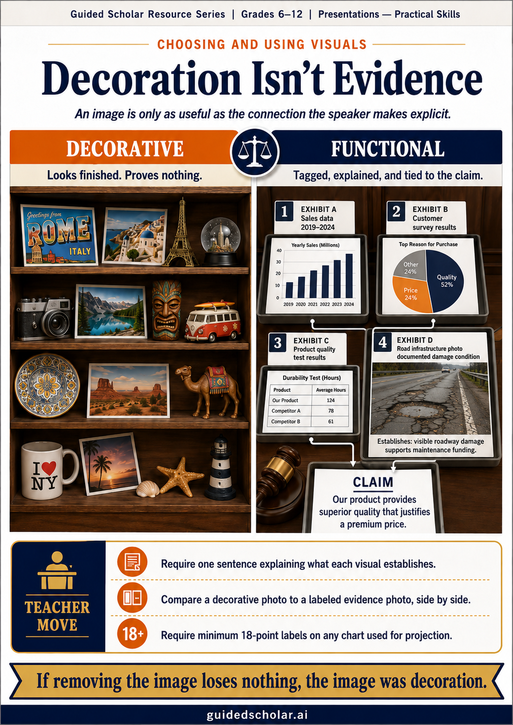
Decorative vs. Functional Visuals
A decorative visual makes a slide look more finished. A functional visual serves the argument. The test is simple: if you removed the image and replaced it with blank space, would the audience understand the presentation less well? If the answer is no, the image is decorative.
A photograph of a crowded factory on a slide about labor conditions is decorative if the speaker never refers to it. The same photograph is functional if the speaker says: “this image is from a 2023 inspection of a garment facility in Bangladesh — the fire exit in the background is blocked by fabric rolls, which is the specific violation my argument addresses.” The image is now evidence. The difference is not the image itself. It is whether the speaker makes the argumentative connection explicit.
Four Types of Functional Visuals
Charts and graphs communicate numerical relationships that prose cannot easily convey. A bar chart showing test score comparisons across five schools makes the comparison visible in a way that a sentence containing five numbers does not. The chart is functional because it reveals a pattern the audience can see and the speaker can develop.
Photographs provide visual evidence for claims about real-world conditions, events, or objects. A photograph of damaged road infrastructure supports an argument about maintenance funding better than any description, because it provides direct evidence rather than a proxy for it. The photograph works when the speaker explains what it establishes, not just what it shows.
Diagrams and flowcharts show relationships, processes, and structures that prose must describe inefficiently. A diagram showing how water moves through a treatment plant makes a complex process comprehensible. The value is the spatial relationship between elements, which text cannot replicate.
Data tables display specific numbers the argument depends on. When a claim requires the audience to see precise figures rather than a summary, a table is more honest and more credible than a chart that rounds or smooths the values.
Common Student Visual Mistakes
The wrong chart type for the data is the most common error. A pie chart implies the pieces sum to a meaningful whole and the comparison is about relative proportion. A student who uses a pie chart to compare test scores across grading periods, or to show five individual students’ attendance records, is communicating the wrong relationship between data points. The chart selection error is an argument error, not a design error.
The unreadable chart is the second most common. A chart that requires the audience to read small axis labels on a projected screen at classroom distance is not a visual aid. It is a source of frustration. Default chart settings in spreadsheet software are built for a screen at arm’s length. A chart intended for classroom presentation needs axis labels at a minimum of 18 points and a clear, legible title. Students who accept default chart formatting without adjusting for projection context produce charts that look correct on a laptop and are illegible in the room.
The stock photo with no connection to the argument is the third. A photograph of a generic cityscape on a slide about urban planning, a smiling student on a slide about education policy, or a globe on a slide about international relations all have one thing in common: they relate to the topic without providing evidence for the specific claim. Students add these images because they have been told that visual slides are better than text slides. They are right, but only when the visual does argumentative work.
Making the Connection Explicit
Any image that serves as evidence needs a spoken statement or caption that makes the argumentative connection explicit. The connection is not the image’s job. It is the speaker’s job. Without the connection, the most functional visual in the world is décor.
The simplest way to teach this is to require students to write one sentence for each visual before the presentation: “this image establishes [specific thing] because [specific reason].” A student who cannot write that sentence does not have a functional visual. She has a decoration. The sentence exercise surfaces this gap before the presentation rather than after.
Practical Starting Points for Teachers
- Require a one-sentence visual explanation for every image in the presentation. Written before the presentation: “this visual establishes [specific claim] because [specific evidence].” A student who cannot write that sentence does not have a functional visual.
- Show students the decorative-versus-functional distinction with a side-by-side comparison. Same slide, same topic: one version with a stock photo that relates generally, one with a specific image that provides evidence for the claim. Ask which one supports the argument.
- Teach chart selection as a brief standalone lesson. Bar charts compare discrete categories. Line charts show change over time. Pie charts show parts of a real whole with fewer than five pieces. Posting this rule eliminates most chart selection errors without individual correction.
- Require minimum 18-point labels on all charts intended for classroom presentation. Default chart settings are built for a laptop screen. Projected charts need larger labels.
The Through Line
The question that makes a visual functional is the same question that makes a sentence functional: what does this establish, and why does it matter to the argument? Students who ask that question before adding an image produce presentations that are visually stronger and argumentatively clearer. Students who add images because they look good produce presentations that appear designed without being so.
Sources referenced: Mayer, R., Multimedia Learning (Cambridge University Press, 2001); Tufte, E., The Visual Display of Quantitative Information (Graphics Press, 2001); Reynolds, G., Presentation Zen (New Riders, 2008).