A teacher reviews a set of spreadsheet submissions. Three-quarters of the class used pie charts. One student used a pie chart to show how test scores changed across four grading periods. Another used a pie chart to compare five students’ individual attendance records. A third used a pie chart to show the relationship between hours studied and grade earned. None of these is an appropriate use of a pie chart. All are extremely common student choices.
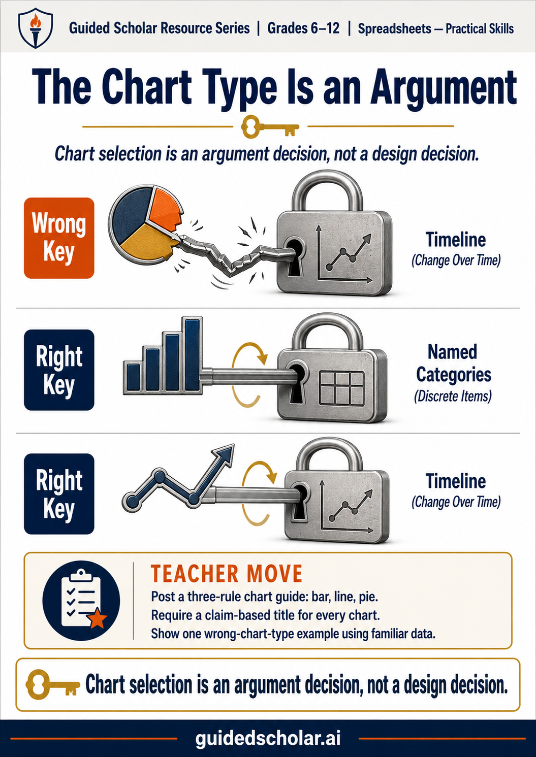
Chart selection is not a design decision. It is an argument decision. The chart type implies a relationship between the data points. Choosing the wrong type does not just look incorrect. It communicates the wrong relationship — which means the chart argues for something the data does not actually support.
Bar Charts: Comparing Discrete Categories
A bar chart works when the question is “how much of each?” or “which one is bigger?” The categories on the horizontal axis are discrete and named, and the comparison is about the size of the bars.
Right use: Test scores by school. Attendance by student. Sales by product. Waste by weekday. The categories are named and independent.
Wrong use: Test scores across six grading periods in chronological order. The sequence matters here — the reader should see the trend. That is a line chart.
The practical rule: if the horizontal axis categories could be reordered without changing what the chart means, it is a bar chart. If reordering would destroy the meaning — because the sequence is the point — it is a line chart.
Line Charts: Showing Change Over Time
A line chart works when the question is “how did this change?” The horizontal axis is continuous, usually time, and the line between points implies that something happened in between. The shape of the line is the information: rising, falling, flat, volatile.
Right use: Student score trends across six assessments. Monthly rainfall over a year. Daily step counts over a semester.
Wrong use: Comparing five students’ average scores. These are discrete categories, not points on a continuum. The line between “Alex” and “Briana” implies a continuous relationship that does not exist.
When a line chart is applied to discrete, non-temporal categories, it implies that the items exist on a spectrum and that something meaningful sits between them. That implication is false, and the chart communicates a relationship the data does not support.
Pie Charts: Parts of a Real Whole (Used Carefully)
A pie chart works when two conditions are both true: the pieces add up to exactly 100 percent of a meaningful whole, and the comparison the student wants to show is about the relative size of the pieces.
Right use: Survey responses to a yes/no/maybe question. Budget allocation across four departments. Market share across three competitors.
Wrong use: Test scores across four grading periods (they do not sum to a meaningful whole). Individual attendance records for five students (the five students are not parts of a single whole).
Pie charts also fail when there are more than four or five slices. Human perception cannot reliably compare the areas of small pie segments. A pie chart with eight slices requires the reader to read the labels, not interpret the visual. A bar chart showing the same data lets the reader compare heights directly, which is a far more reliable task.
The Chart Title That Makes the Chart Useful
Chart selection determines the relationship the visual implies. The chart title determines whether the chart makes an argument or just displays data.
Description title: Test Scores by Grading Period → tells the reader what the chart shows.
Claim title: Scores Rose Each Quarter After Tutoring Began → tells the reader what the chart means.
The claim title communicates that the student identified a pattern in the data and decided what it means. A teacher who requires claim-based titles for all charts requires students to do the analytical work the chart is supposed to support. Students who write description titles have displayed data. Students who write claim titles have made an argument.
Practical Starting Points for Teachers
- Post a three-rule chart selection guide and require students to reference it. Bar: comparing named categories. Line: showing change over time. Pie: parts of a real whole, five slices or fewer. This rule eliminates the majority of chart type errors without individual correction.
- Require a claim-based title for every chart. Not a description of the data. A statement of what the data establishes. The title is the evidence of analytical work.
- Show one example of the wrong chart type applied to familiar data. Students who have identified the mismatch between chart type and data relationship once are significantly less likely to repeat the error. The concrete example does more than the rule stated abstractly.
- Build chart type selection into the rubric. A criterion that asks whether the chart type appropriately represents the data relationship makes the selection a graded decision rather than an unassessed default.
The Through Line
A bar chart, a line chart, and a pie chart are not interchangeable visual formats for the same data. Each one implies a specific relationship. Choosing the right one requires the student to understand what relationship the data has and what relationship the argument needs the audience to see. That decision is the analytical work the chart assignment is designed to produce. Most students have never been taught to make it consciously.
Sources referenced: Tufte, E., The Visual Display of Quantitative Information (Graphics Press, 2001); Few, S., Show Me the Numbers (Analytics Press, 2004); Evergreen, S., Effective Data Visualization (Sage Publications, 2017).